ST ENGINEERING
About
Project Completion - Jan 2022
Under the guidance of ST Engineering - GeoInsights
My Role
User Research
Feature Enhancement
Visual Design
Results
Created a more cohesive visual design across the platform.
New ideas on features on how to improve user experiences.
Carbon Finance Dashboard
This was an individual month-long project for ST Engineering GeoInsights during my internship. GeoInsights offers analytics, information products and value-added services based on satellite imagery to address growing global demand for timely insights.
Background
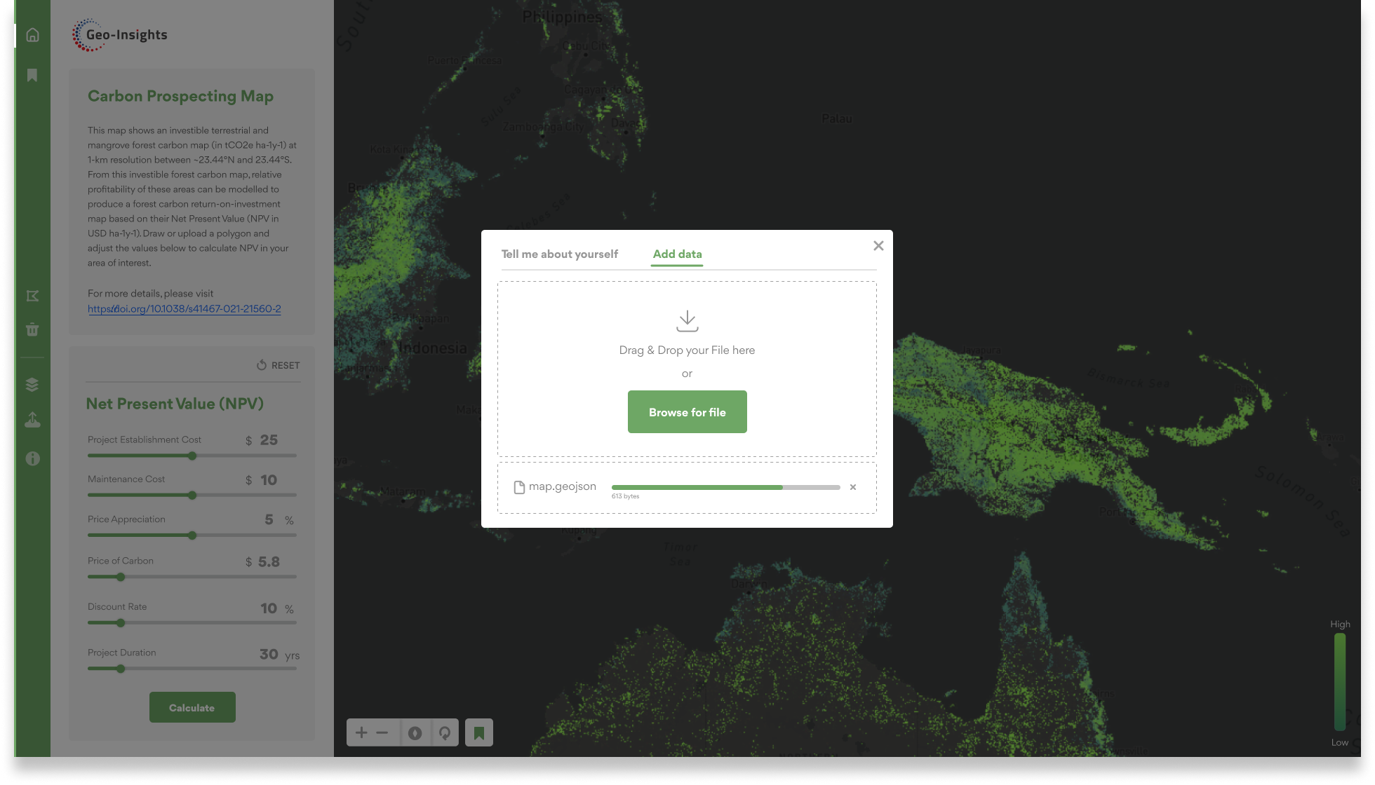
CNCS is a platform designed to allow customers to identify the profitability in areas through a forest carbon return-on-investment map based on their Net Present Value.
This platform is also imperative to implement other conservation interventions, in addition to carbon finance, to safeguard carbon stocks and biodiversity in vulnerable forests.
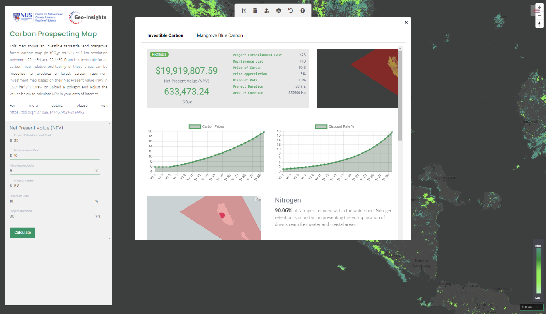
A screenshot of what the dashboard looked like originally.
Identifying The Key Problems

The platform features inconsistent design languages and styles across elements like headers, sidebars, and navigation bars. Moreover, the placement of information and elements is disorganized and confusing.
Creating a cohesive design is crucial to ensure a better user experience.

01. Consistency
02. Analytical Database
The platform's analytical data is hard for users to understand, hindering their ability to assess the area's profitability.
03. Saving Database
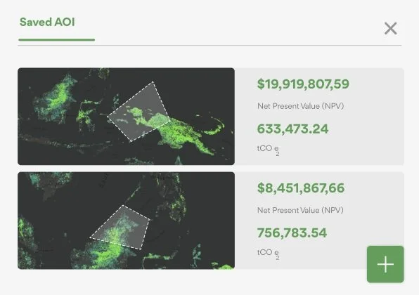
User interviews revealed that the ability to "save" searched databases of profitable areas is crucial for efficiency. Users were frustrated by the lack of a way to revisit previously drawn AOIs (Areas of Interest).
Design Goals
How might we re-design Carbon Finance, to allow an easier flow of information displayed to the user?

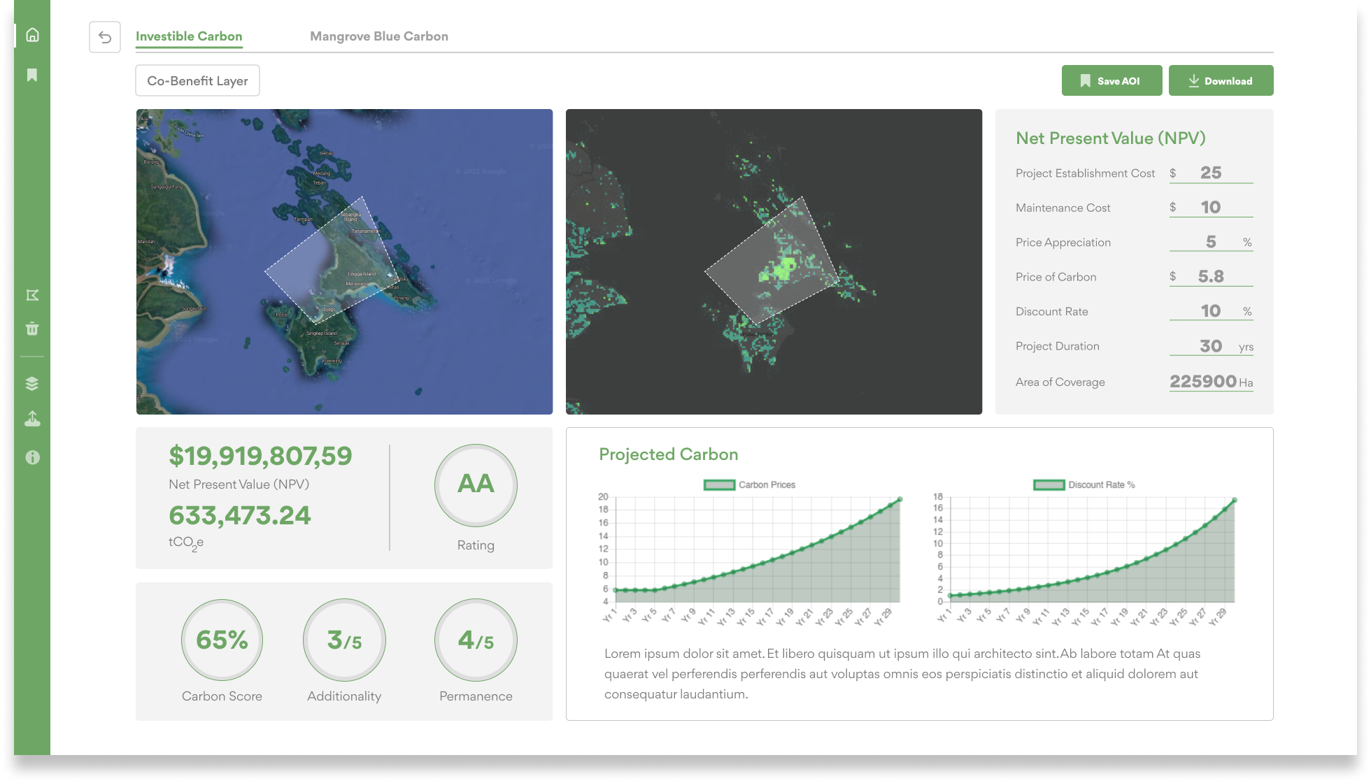
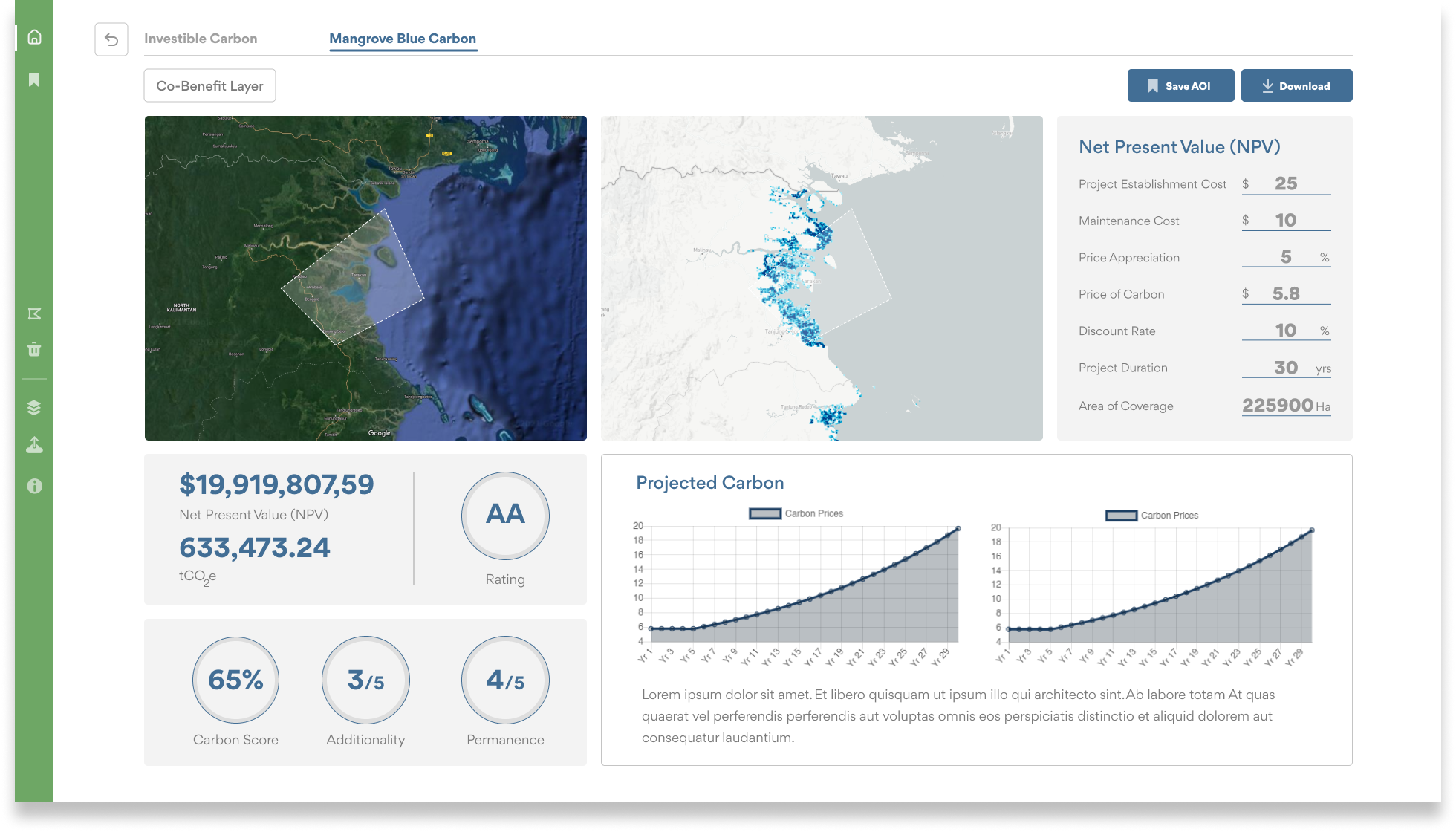
New Features & Components.
01
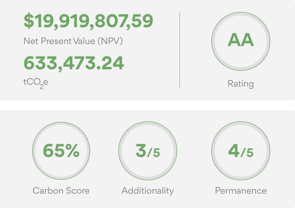
Rating System
The rating system offers customers a clear summary of information.
By designing an effective data display and exploring information filtering methods, we can implement a scoring system in the database that assigns point values to each category.

02
Satellite Map
By implementing satellite mapping in the database, we enable easy comparison and reference. This allows users to answer questions like, "Why is this area higher in carbon?" and "What does the area look like?"
03
Saved AOI
The saved AOI feature provides users with easy access to previously drawn AOIs on the platform, enhancing their experience by allowing instant and efficient retrieval of past areas of interest.
THE Outcome
An Efficient & Cohesive Database Journey For Customers
By redesigning the platform, we improved information delivery, promoting faster access and better engagement among visitors.
The implementation of an AI-driven rating system helped address information overload by providing users with an instant overview of an area's profitability.
Additionally, enhancing the overall design language and style resulted in a more cohesive and consistent platform, strengthening the product's identity and recognition.
My Reflection
Working on this project independently was both challenging and rewarding. I gained valuable knowledge and insights by collaborating with developers, software engineers, and geospatial analysts. I appreciated sharing and receiving feedback from various stakeholders, which highlighted the importance of clear communication, as each stakeholder has design limitations.
As my first UI/UX design project, it has expanded my perspective as a designer and deepened my understanding of the tech industry.


